Looking to add some tropical flair to your art or just want to learn how to draw a palm tree? You’re in the right place! This article will show you the top 3 palm tree drawing tutorials with no art experience needed! You’ll learn how to draw a detailed / realistic palm tree, as well as a cartoon version plus a palm tree outline, with sketch tips and tricks to help you along the way. Let’s get started!

Contents
- How to Start Drawing a Detailed Palm Tree with Leaves (Realistic)
- How to Draw a Cartoon Palm Tree
- How to Start Drawing a Palm Tree Outline in 3 Steps
How to Make a Detailed Palm Tree Drawing with No Art Experience
1. Learn to Sketch a Detailed Palm Tree Drawing with Leaves, Realistic Style
1. Draw the Trunk
Let’s first start drawing the trunk. Sketch a slightly curved and angled line. This is essential for getting a detailed or realistic palm tree drawing because palm trees normally don’t have perfectly straight trunks, they look like they slightly sway to one side.

2. Draw the Rest of the Palm Tree’s Trunk
Try your best to draw the same shape of the trunk like you did in step 1, for the trunk’s right side and make sure to taper it, making the trunk wider at the bottom. This makes your palm tree sketch more believable and realistic.

3. Draw the Sand
Draw a few curved lines of sand at the bottom of the tree, for more detail and realism. This makes your sketch look more realistic and detailed.
Add a couple spots to the sand to really make it stand out.

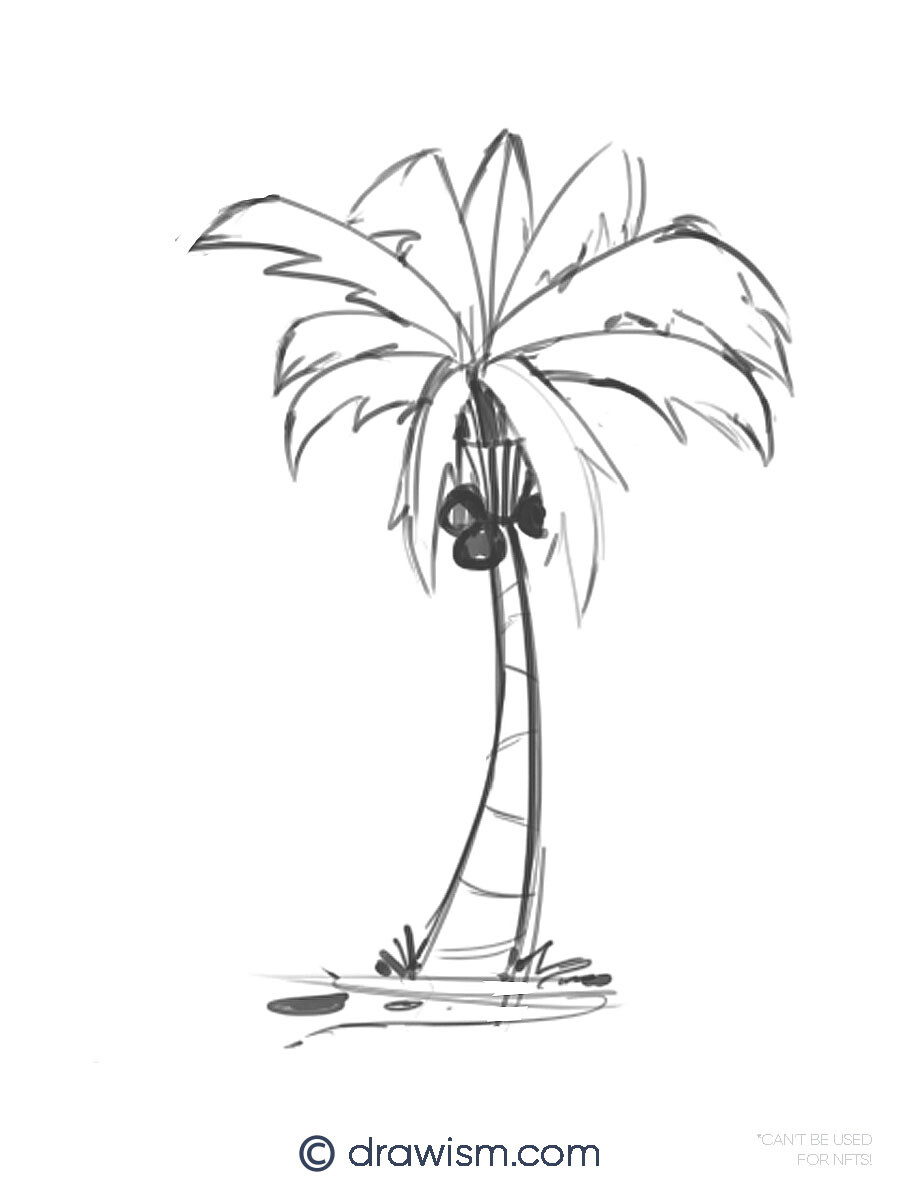
4. Draw in Trunk Details
Let’s add some details to the palm tree’s trunk. Sketch in slightly curved lines within the trunk, leaving some space between each section. These lines section off the trunk, making it more realistic.

5. Draw the Husk
Draw the husk at the top of the trunk with a few simple dabs or lines. A palm tree’s husk is where the coconuts and leaves sprout from, so having this unique detail in your drawing makes it feel more realistic.

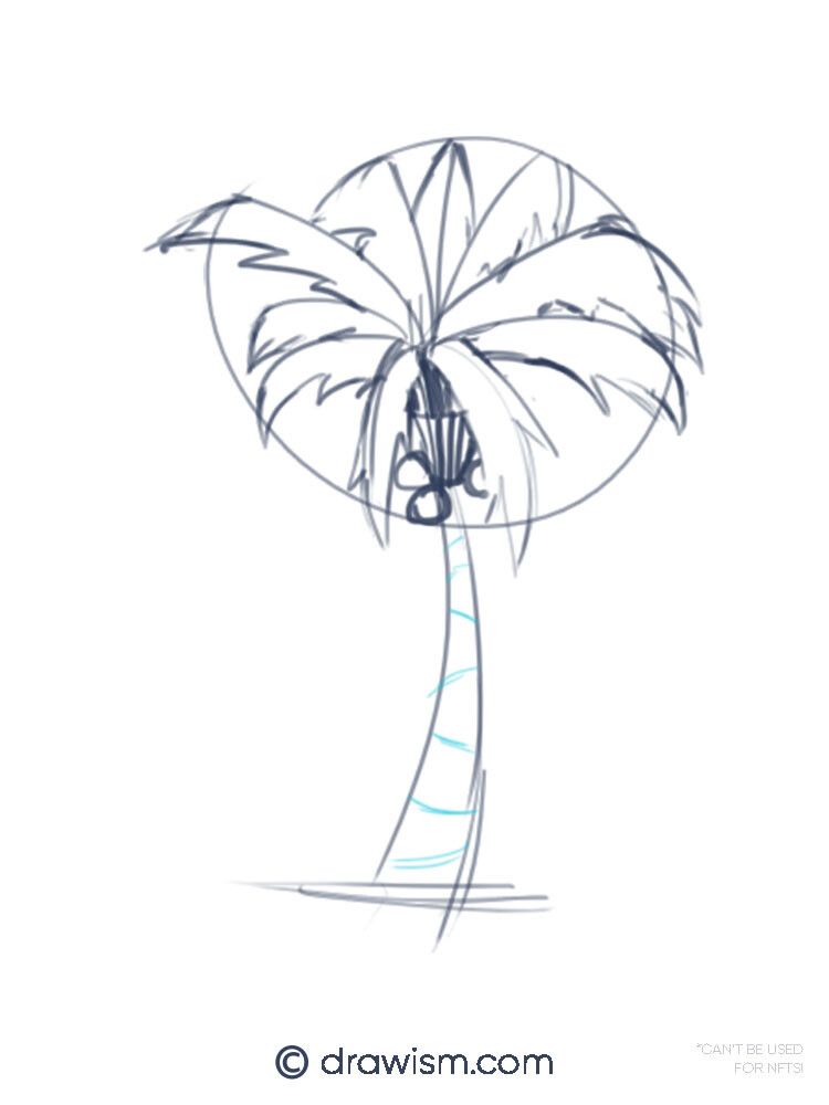
6. Sketch Where the Palm Tree’s Leaves will be
Before we start drawing the leaves, here’s a fun fact: palm trees don’t have branches. Their leaves actually grow on top of the trunk!
If you’d like to learn how to a draw a tree branch, check out this easy drawing tutorial for beginners showing How To Start Drawing a Simple Tree Branch Freehand!
Next, let’s start drawing the leaves!
When making a palm tree drawing with leaves, it’s easy to be overwhelmed with all the details. So lets’ simplify it by just sketching lines for where we want our leaves to be. This will make drawing the leaves 1,000 times easier!

7. Scribble in the Leaves
Now for the fun part! Instead of drawing the leaves one-by-one (which will take so much time and look uneven) just scribble them into the sketch lines you drew in the previous step! Not only will you get a lot of detail but your palm tree drawing will look realistic pretty fast! It’s that simple.

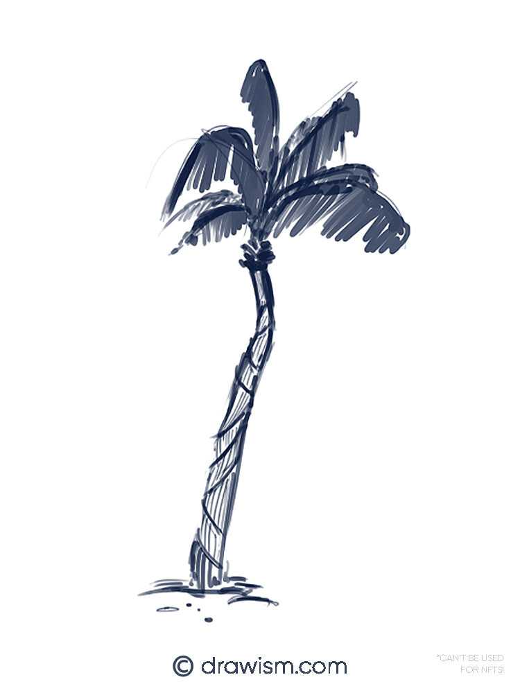
8. Finished Detailed Palm Tree Drawing with Leaves
Congrats, you’ve finished drawing a realistic and detailed palm tree drawing!
To add even more detail and realism, you can shade in the trunk by drawing in quick, short lines in each section of the trunk and that’s it!
Amaze your social circle with this awesome drawing or post it to social media and show it off.
2. Draw a Cartoon Palm Tree

1. Start with Drawing the Tree’s Leaves
Let’s start drawing a cartoon palm tree by first making a circle. This will be the base sketch for the palm tree’s leaves and is essential for making them uniform and correct.

2. Sketch the Trunk
Starting close to the bottom of our leaf circle, draw 2 curved vertical lines for the palm tree’s trunk. Make sure they taper from top to bottom to give your drawing more volume. The more curved and tapered you make the trunk, the more cartoony your palm tree will look!

3. Sketch in Curved Lines for the Leaves
Draw curved lines from the center of the circle to the rim, making sure they’re coming from all directions. These lines will make it a lot easier for us to draw in the palm tree’s leaves.

4. Draw the Leaves’ Fronds
Using each line you drew for the leaves in the last step, draw in the rest of the leaves with curved and sharp fronds. This makes our palm tree drawing look a bit more cartoony.

5. Draw the Palm Tree’s Husk
Where the leaves and trunk meet, draw in the husk. You can think of this shape as a pair of bikini bottoms to make it easier to draw!

6. Let’s Draw the Coconuts!
Around the husk, just draw 2–3 circles for the coconuts to make it look more like a cartoon palm tree!

7. Add Details to the Palm Tree’s Husk
Draw in some detail to the husk to add more dimension. Just draw lines inside the husk’s outline, nothing fancy!

8. Draw the Trunk’s Details
Let’s add some details and dimension to the palm tree’s trunk by sketching in curved lines. You can make them straight or in a slope to make your palm tree drawing fit the cartoon style better.
9. Let’s Add the Sand
To finish your sketch, add some cartoon sand and plants!

10. Fill In the Coconuts and Make a Darker Trunk
To finish off your cartoon palm tree drawing, you can color or shade in the coconuts and make the trunk thicker, by drawing over it once or twice.

11. Finished Cartoon Palm Tree Drawing
Congrats, you’ve finished drawing a cartoon palm tree! Give yourself a pat on the back and feel free to add this to your sketchbook, journal, or anything else that needs a bit of tropical cartoon flair!
3. Drawing a Palm Tree Outline
Unlike the previous palm tree sketches, this quick tutorial will focus on only drawing a palm tree outline instead of all the little details inside the doodle.
This type of drawing is fantastic because it’s both quick and very simple to sketch. Plus, you can add your own details and designs inside the line work if you like.
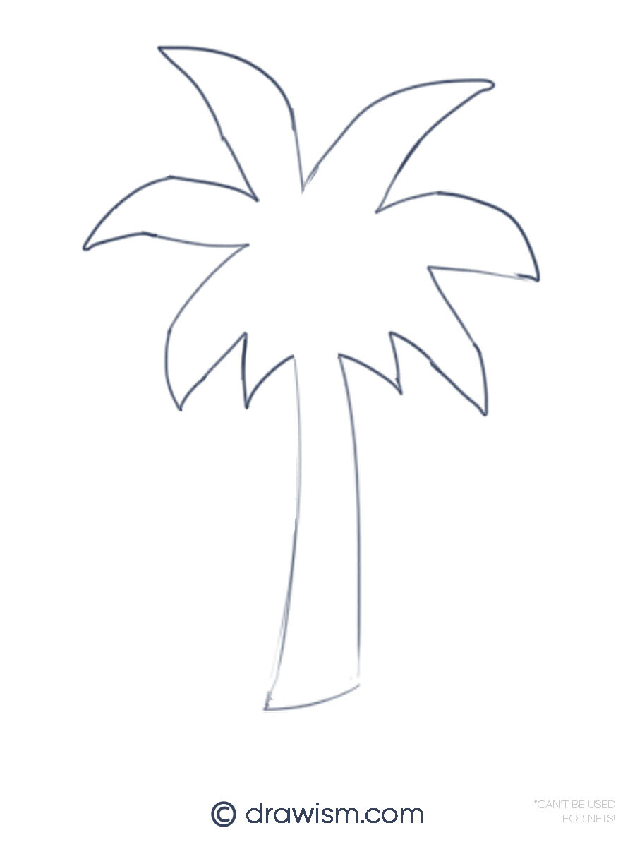
1. Draw the Trunk Outline
This step is quite simple — draw a slightly curved and tapered rectangle, without the top line. You can also curve the bottom line of the trunk a bit to make it look more rounder and voluminous.

2. Draw the Leaves
Instead of drawing each individual leaf (which can take more time and can come out quite uneven), let’s sketch the palm tree’s leaves in reverse!
Have a general idea of where the center of the tree’s leaves are. You can even make a little mark in the center of where you want to draw your leaves, to help guide you in drawing their outline.
Once you’re ready, just start drawing ‘V’s’ in different sizes, around the palm tree’s trunk. Nothing fancy!

3. Draw in the Ends of the Leaves
Looking good so far! To finish drawing your palm tree outline, let’s draw in the ends of the leaves.
All you need to do is sketch in the curved points of each leaf. Try to connect the ends of the lines as best you can to the rest of your palm tree drawing to complete your outline.

4. And You’re Palm Tree Outline is Finished!
Super easy, right?

If you’d like, you can clean up the outline of your palm tree by erasing out the sketch lines inside the drawing and anything else that looks out of place.
You can add this drawing to your sketchbook, notebook, or planner and add anything else that you’d like!
Palm trees come in all different shapes and sizes. You can use these drawing tutorials as a guide to sketch different types of palm trees, whether they’re short, tall, or somewhere in between. You can check out this awesome guide written by Georgette K. showing 43 different types of palm trees for a bit of drawing inspiration!
If you’d like to learn how to draw more nature, check out these other easy and fun drawing tutorials:
- How to Make a Fantasy Mushroom Drawing Step by Step | Post
- 10 Dreamy Fantasy Mushroom Drawings to Try Now | Post
- How to Draw Clouds with Pen & Ink Easy | Post
More Related Drawing Tutorials, Art Tips, & Cheats (Outbound Links)
For more quick and easy drawing tutorials with no art experience and how to get started drawing fast, check out some of these helpful articles below!
- How to Draw a Simple Tree Branch Freehand | Post
- How to Start Drawing with No Art Experience | Post
- How to Get Back into Drawing After a Long Break | Post
- 15 Random Doodles to Draw When You’re Bored | Post
- 9 Brutal Truths Before You Start Drawing to Always Be Successful at Art | Post
- Sketching on Silky Smooth Drawing Paper with Ink & Colored Pencil | Post
- 6 Best Figure Drawing Poses for Stunning Character Designs for Beginners | Post
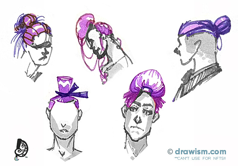
- How to Draw Hair Buns for For Females & Males | Post
- How to Draw an Egg Shape — Self Taught Drawing Tutorial | Post
- 5 Insanely Simple and Fun Drawing Ideas of People for All Skill Levels | Post
- 15 Satisfying Heart Drawing Ideas | Post
- Art Anxiety: How to Be Confident with Your Art | Post
Which palm tree drawing do you want to try first? Leave a comment below!
The article 3 Best Palm Tree Drawing Styles with No Art Experience was originally published on Drawism.com first.